
As of 25 March 2020, the World Health Organization (WHO) has confirmed well over 400,000 global cases of the novel coronavirus—COVID-19. The real case numbers, of course, are likely far higher. As this pandemic continues to claim lives, dominate media, and damage economies, many observers are trying to understand the patterns of this contagion to better understand what to expect and how to evaluate their country’s effectiveness in combating the pathogen. This is particularly true in the United States, where despite difficult access to COVID-19 testing, confirmed cases now number well over 50,000 and appear to be quickly outpacing the number of cases seen in other countries.
A common defense for the skyrocketing numbers in the US is population size. In other words, given the sheer size of the US population, estimated by the World Bank to sit near 330 million, we should expect far more cases to arise than in a country like Italy, with a population around 60 million. Proponents of this defense will be less concerned with the exponential increase in American cases under the expectation that it is simply natural.
There is no doubt that this intuition makes sense on its surface. It is both natural and logical to control for population size by dividing the number of known cases of infection by the size of the population, or even creating a count of cases per 100,000 people, in order to assess the overall impact of a disease on a country. Such practices are typical for comparative studies and are particularly valuable after an epidemic runs its course. However, it makes very little sense to do this in the early stages of an epidemic for several reasons. Most important is the fact that viral transmissions do not care about the size of the overall population, but rather care about the immediate access to a population that are susceptible to infection.
What does this actually mean for a novel virus like COVID-19? While there are a range of epidemiological models to consider, a common starting point is the expectation of a logistic curve, or an s-curve, as illustrated in the figures below. The line represents the total cumulative cases over time, starting with exponential growth. In other words, the growth rate in the number of cases will be constant over some unit of time, for example, doubling each week. This is what most observers have been paying close attention to: the number of days it takes for COVID-19 infections in a country to double. And because of the limited number of tests, these numbers are ultimately underreported.
Ph.D. astrophysicist and senior contributor at Forbes, Ethan Siegal’s recent article puts the hazards of exponential growth in stark perspective. Siegal notes, “Exponential growth is so powerful not because it’s necessarily fast, but because it’s relentless,” and “Without introducing a factor to suppress it…is an infectious disease doctor’s nightmare, particularly as more time goes on.” Liz Specht, Associate Director of Science & Technology at The Good Food Institute and one of the earlier commentators on the COVID-19’s possible trajectory in the US, used basic statistics to demonstrate how the US healthcare system could become overburdened very quickly. A shortage of hospital beds (the US has approximately 2.8 per 1,000 people) and depleting stockpiles of protective equipment like masks can exacerbate an already difficult and evolving public health crisis.
This is already being seen in multiple respects. Governors have lamented their inability to buy additional supplies. Kentucky governor Andy Beshear, for example, specifically described a case in which the Federal Emergency Management Agency (FEMA) outbid them for crucial equipment at the last minute. Even testing for the virus has been difficult, with the US CDC originally distributing an unreliable test and the Trump administration more generally showing very little commitment to increase access to testing. The lack of domestic capacity was put on full display when South Korea, in contrast proving to be very capable of mass testing, agreed to a Trump request to provide support for American test kits.
But beyond concerns of burdening the capacity of health infrastructure in the short term, there is the larger concern of “how bad will it get.” Particularly concerning is that a new pathogen like COVID-19 has found a population with no prior exposure wherever it goes. And no prior exposure to means no immunity. Why is no immunity a problem? No immunity is a problem as every individual offers the virus the potential for a new infection. Each new day will see more people get exposed to the virus, a fraction of those exposed will lead to new infections, and those new cases will then follow suit. Some percentage of those infections will then require hospitalization, and a fraction of those will succumb to the disease. Unsurprisingly, accurate numbers are quite difficult to obtain in real-time, but the Center for Disease Control and Prevention’s (CDC) 18 March 2020 report (covering the period from 12 February – 16 March) reported that at least 12 percent of known cases in the US required hospitalization.
Explaining infection rates
So how does the United States compare to others? The answer to this question is best explained through illustration of how unchecked epidemics are assumed to operate. For the sake of this discussion, we can consider some common starting points in the field of epidemiology and infectious disease. First, assume a first or primary episode of infection starts in two countries at the same time. Second, this case, and those that follow, will typically lead to two other infections. Third, we will assume this will occur within in one week. Next, we will assume the rate of infection starts to slow when the vulnerable population is reduced. In other words, the rate slows when more people get infected, limiting the number of potential ‘new’ hosts for the virus.
This is an example of a classic SIR model of epidemiology, which is built on proportion of a population that is susceptible, infected, or recovered/removed. As the numbers of infected, recovered (assuming acquired immunity), and removed (through death) increase, the number of susceptible individuals decreases. The proportion of people that an infected person exposes themselves to will become less likely to be infected. The pathogen begins to find it difficult to infect new people.
For the purposes of this illustration, we will assuming the infection rate drops from 2x to 1.5x when the percentage population that has been infected hits 20 percent (or the susceptible population hits 80 percent). During this period, each infection will result in an average of 1.5 new infections. The rate further drops to 1.25x when the virus has infected 30 percent of the population, 1x when it hits 40 percent, 0.5x when it hits 50 percent, and 0.25 when it hits 60 percent.
In our example, Country A (population 1 million) and Country B (population 10 million) see their first case of a novel virus in the same week. As the epidemic advances, and as members of the population either recover (with acquired immunity) or pass away, the proportion of the vulnerable population dwindles. As a result, the pathogen has a more difficult time finding new people to infect. Rather than each infected individual infecting 2 new people on average, this continues to drop as the number of vulnerable population decreases. Eventually, the case numbers hit an inflection point where the rate of increase in infections begins to slow down and, eventually, plateau. At this point, the outbreak effectively ends. This is what herd immunity, a process by which enough people get infected, develop immunity, effectively limiting the number of potential options for the virus, is all about.
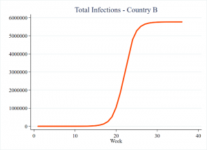
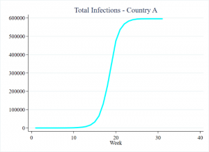
The cumulative number of infections in this exercise appears as follows. The curves appear very similar, though Country B has disproportionately more cases due to its larger population. However, closer inspection of the earlier weeks reveals that irrespective of population size, the case numbers actually remain identical.
Whether you are Country A with 1 million people, or Country B with 10 million people, the epidemic begins in each country with one case. If we assume the cases originally double in each week, the progression of total cases would start out similar. One case the first week. Two cases the second week. Four cases the third, and so on. Importantly, this progression in absolute numbers does not change based on what the total overall population is—the pathogen still has plenty of potential options to choose from as the entire population is not all exposed at once. It must work its way through it, infection by infection. Regardless of the overall population size, the virus has little difficulty finding susceptible numbers early in the outbreak.
Here’s when we should start considering population size
However, the total size of the population eventually does matter. We will start to see differences arise when the virus begins to have more difficulty in finding vulnerable targets in Country A (the smaller population). But this takes time, as illustrated in the below figure.
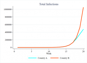
Returning to the concept of exponential growth, from each country’s first case in week 1, and doubling new cases each week, both would see over 131,000 cumulative cases in week 17. At this point, 13 percent of Country A has been infected, but only 1.3 percent of Country B has been. Given these parameters, by week 18, 20 percent of Country A’s total population will become infected. With the vulnerable population shrinking, new cases ultimately begin to slow.
Country A has now hit its inflection point, where the number of new cases stops accelerating and begins to expand in smaller number. Only at this point will we start to expect differences in total cases. With an original vulnerable population of 10 million, the 131,000 cases in week 17 still leaves over 98 percent of Country B’s population vulnerable to infection. While Country A’s new infections quickly begin to decline, Country B’s new cases will continue to double each week until it hits its own inflection point, the 20 percent mark it will not hit until Week 22.
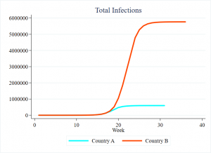
The result? Country B will ultimately have 10 times as many cases as Country A. The epidemic will last three months longer in Country B. Country B’s worst week will see nearly 1 million new infections, almost the entire population of Country A. But for the first 17 weeks, they would have had the same number of cases.
The US and Italy
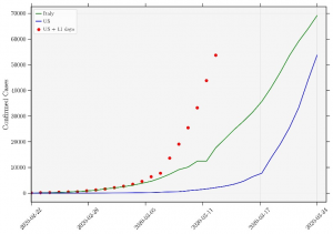
Italy has unfortunately established itself as the grimmest example of COVID-19’s toll. Consequently, it is unsurprising that many would look to Italy for both lessons and comparison. Unfortunately, the United States does not stack up well. The below figure reports cumulative case totals for each country, by reporting date. Cases appear in green for Italy and blue for the United States. As with the figures above, we see a small number of initial cases slowly transform into a clear exponential increase. While Italy’s case numbers were originally greatly outpacing those of the United States, the latter’s slope continues to grow taller, its numbers approaching those of Italy.
However, the lag witnessed here is specifically due an important difference from the example of the hypotheticals provided above. The outbreak began later in the United States, with the best guess being 11 days. The red dotted line takes this into account. In short, the line represents the same data as the line, just moved to five days earlier. Whereas before the United States appeared to have the unfortunate distinction of quickly catching up to Italy, the reality is that the United States has long been ahead of Italy’s pace. And again, this is not due to differences in total population.
Trying to generalize
If the US’s numbers look bad this quickly, it is not because the United States is a country of over 300 million people. The only exception to this would be comparisons to extremely small polities in which thousands or tens of thousands of cases would have already exhausted the vulnerable population.
The implication of basic models such as this would be that people who are infected in the United States are tending to infect other people at a higher rate than what is being seen in other countries. However, this could be due to a variety of issues in the real world. The assumption “all else being equal” that is ubiquitous in basic models, for example, rarely applies. There are differences in hygiene. Differences in lifestyle. Variation in the number of people that infected individuals expose themselves to. Slow government response. The possibilities are endless. Total population size, however, is not a logical explanation for COVID-19 cases in the United States.
It is also likely going to be the case that there was not a progression from a single primary case. Instead, dozens—or perhaps even hundreds—of infected individuals likely returned to the US from abroad, quickly establishing numerous independent clusters across the country. In other words, there is no single “patient zero” in the United States, but many primary infections for independent clusters. But the same is likely true for places like Italy, and even this itself could be seen as the product of slow reaction to the epidemic.
Though in our illustrative example above it is useful to simplify things by assuming a rate of infection of doubling each week, this will depend on conditions that ultimately vary in the real world. Perhaps the most easily measurable is population density, as infections in densely populated areas could see more encounters with susceptible people. But while places like New York City are densely populated, the United States as a whole is not. In fact, data from the World Bank shows that its population per square kilometer is less than half that of Italy. In short, national statistics do not work in favor of explaining the US infection rate in terms of national population.
It is also worth pointing out that the parameters in the illustrative example presented here are actually quite conservative. Recall that this approach saw a 20 percent reduction in the vulnerable population begin to quickly slow the spread of new cases, and the outbreak ended after 60 percent of the population was infected. Barring intervention, a team of epidemiological modelers from Imperial College’s COVID-19 response team actually expected this to be far higher, perhaps over 80 percent of the population facing infection. In short, without interventions such as social distancing, COVID-19 will have an easier time finding new cases than the hypothetical pathogen reported here.
Further, this exercise reflected two very small populations. The World Bank for instance reports at least 90 countries with a population size of at least 10 million. Italy and the United States, for example, are well beyond this. The practical implication of this is that it should take longer to see a gap in infections to arise between the two places. Our example again biases toward an earlier gap between the two countries, and their inflection points would be hit far sooner than a larger country like the United States.
All else being equal, the tale of the tape may be as follows:
| Milestone | Country A | Country B |
|---|---|---|
| First case | Week 1 | Week 1 |
| 10,000 Cases | Week 14 | Week 14 |
| 100,000 Cases | Week 17 | Week 17 |
| 500,000 Cases | Week 21 | Week 19 |
| 1 Million Cases | Never | Week 20 |
| 5 Million Cases | Never | Week 25 |
| Total Cases | 595,455 | 5,766,911 |
| Epidemic Ends | Week 31 | Week 46 |
Looking Forward
It is important to note that this exercise largely assumes non- or limited-intervention strategies by governments. And this was indeed the case very early on for several countries, including the US. Still, while many countries were relatively slow to respond, we have seen sweeping reactive policies ranging from stay home orders across several US states to nationwide lockdowns in countries like India. South Africa has jailed people who have broken stay at home orders, while Rwanda has reportedly seen such violations result in being killed by the security services.
The effectiveness of such strategies remains to be seen, but the general expectation is that such actions can help slow the rate of transmission. Slowing infections in the short term has the benefit of “flattening the curve,” or reducing the number of cases to a point that it does not overwhelm the healthcare infrastructure. But this also lengthens the amount of time it will take to reduce the susceptible population to a point where the virus has difficulty finding new carriers. This takes time, and it will certainly take far more time than what would be represented by President Trump’s desire to “reopen” the United States in early April. If his suggestions are followed, whatever gains that will have been made in slowing COVID-19’s progression will be quickly unraveled.
As Dr. Antony Fauci, stated on ABC News’ program This Week With George Stephanopoulos, “For me, the dynamics and the history of outbreaks is you are never where you think you are…if you think you’re in-line with the outbreak, you’re already three weeks behind. So you’ve got to be almost overreacting a bit to keep up with it.”
*****
Jonathan Powell is an Associate Professor at the University of Central Florida’s School of Politics, Security, and International Affairs. After receiving his PhD from the University of Kentucky, he spent two years at Nazarbayev University in Kazakhstan. He joined UCF in August 2014, where he has taught classes on Comparative Politics, Research Methods, the International and Comparative Politics of Africa, Politics of the Middle East, and Revolution and Political Violence. His research has explored various dynamics associated with political instability, democratization, and human security. His work has been published in outlets including J of Conflict Resolution, J of Peace Research, African Affairs, Democratization, Foreign Policy Analysis, and Armed Forces & Society.
Christopher Faulkner is a Visiting Assistant Professor in International Studies at Centre College where he instructs courses on comparative politics, national and international security, and African politics. He received is PhD in Security Studies from the University of Central Florida in 2019 and was a recipient of the United States Institute of Peace and Minerva Research Initiative’s Peace and Security Fellowship. His work has been published in outlets such as African Security, Democratization, the European Journal of International Affairs, and Third World Quarterly.
This article was written as part of the Addressing Global Crisis Project (AGC), which is run by the University of Central Florida’s Office of Global Perspectives & International Initiatives (GPII). AGC examines how governments, individually and collectively, deal with pandemics, natural disasters, ecological challenges, and climate change. AGC is organized around five primary pillars: (1) delivery of services and infrastructure; (2) water-energy-food security; (2) governance and politics; (4) economic development; and, (5) national security. Through its global network, AGC facilitates expert discussion and features articles, publications and online content.